> ## Documentation Index
> Fetch the complete documentation index at: https://www.usenotra.com/docs/llms.txt
> Use this file to discover all available pages before exploring further.
# Cards and columns
> Link to other pages with cards, and lay them out in a grid.
Cards link to other pages with a title, a short text and an optional image, and `CardGroup` lays them out in a grid.
## Card
```mdx theme={"system"}
Guides and API reference for Acme Flow.
```
A card with `href` is a link, where full URLs get a ↗ after the title and paths like `/blog/launch` get a →.
The card's headline.
Turns the whole card into a link, with a full URL or a path like `/blog/launch`.
An image shown across the top of the card, cropped to 16:9, as a path like `/images/cover.png` or a full URL.
A short line at the bottom, like "Read more", which is text rather than a separate link.
Links inside a card that has an `href` show as plain text, because a link can't contain another link.
## CardGroup
`CardGroup` puts cards side by side, and `Columns` is the same component under another name.
```mdx theme={"system"}
Shape the release.
Publish everywhere.
See what worked.
```
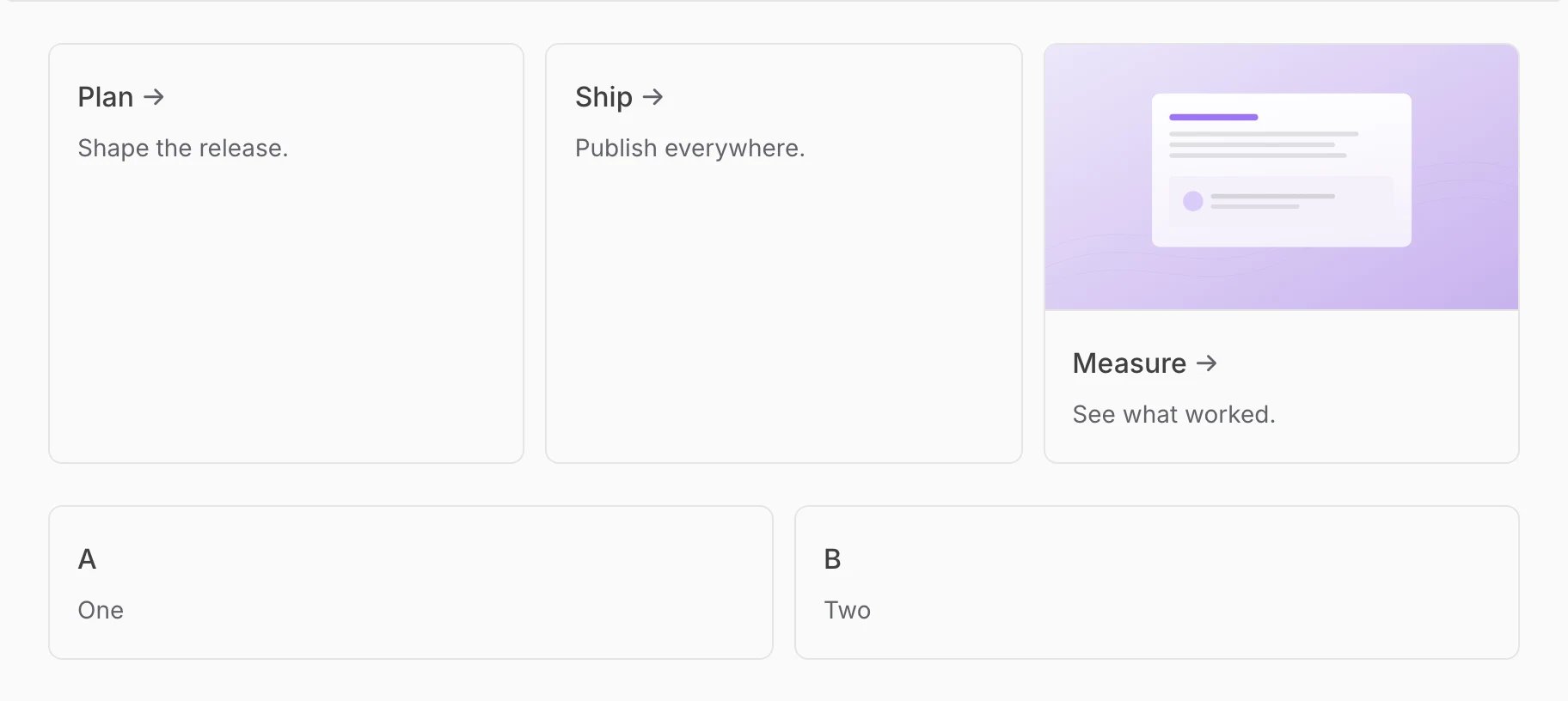
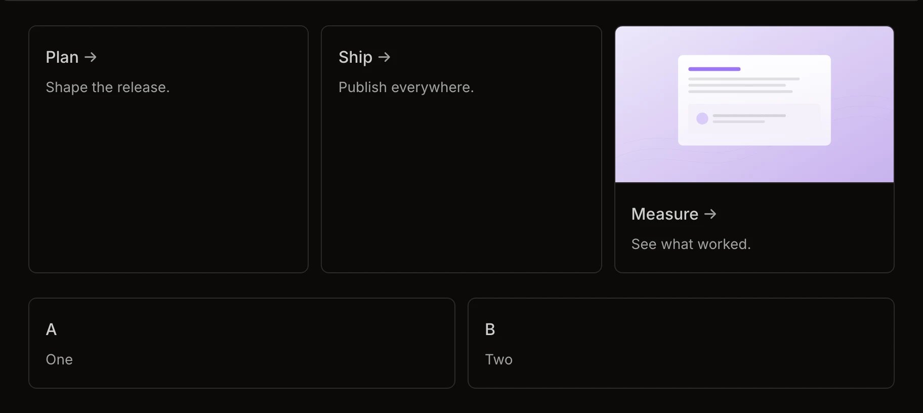 Columns from 1 to 4 on wide screens, while cards always stack on phones.
## Styling
Cards carry the class `card` and groups carry `card-group` and `columns`.
This documentation is built and hosted on [Mintlify](https://mintlify.com), a developer documentation platform.
Columns from 1 to 4 on wide screens, while cards always stack on phones.
## Styling
Cards carry the class `card` and groups carry `card-group` and `columns`.
This documentation is built and hosted on [Mintlify](https://mintlify.com), a developer documentation platform.